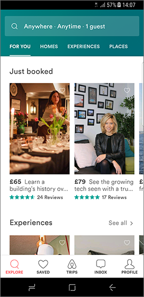
- App home screen uses bottom navigation for navigating throughout the app.
- It provides a search bar at the top and scrollable tabs beneath it.
- The content on the screen is divided into sections like Just booked, Experiences etc…
- The content card points out information like price, brief description, rating and number of reviews. Which are easily visible to the user at first glance.
