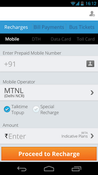
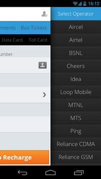
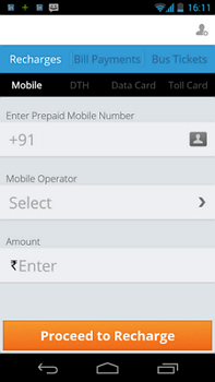
In this example, operator has to be selected. User taps on the field and the screen moves / slides to the left to give space to show the list.
Good points:
– Parent screen is visible. Very good from UX perspective that user still knows the context where it started from. Makes user more confident in what he is doing.
Improvements:
– Parent field name is not visible. It can be made visible and also that field should be highlighted telling user as to for which field he is selecting the data.


