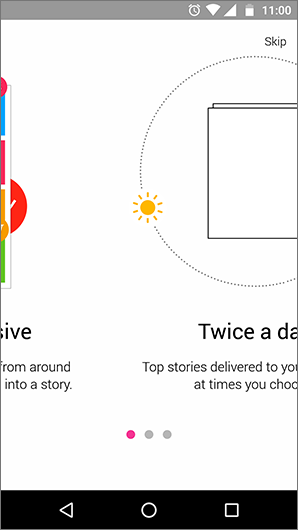
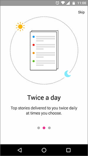
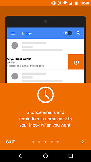
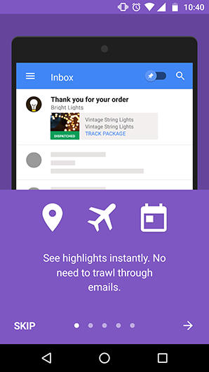
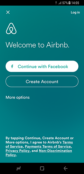
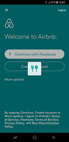
Animated walkthrough with moving and rotating icons and images and it looks very nice when we swipe to the next walkthrough.
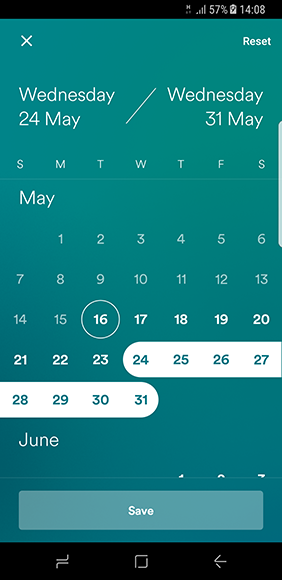
Calendar with selected Date range
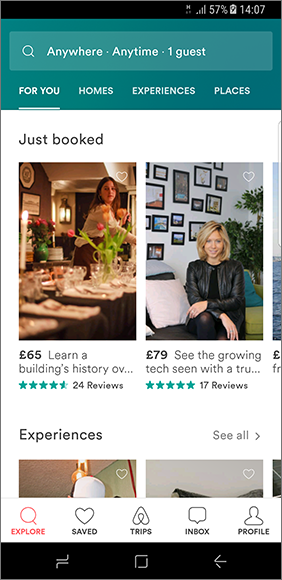
- App home screen uses bottom navigation for navigating throughout the app.
- It provides a search bar at the top and scrollable tabs beneath it.
- The content on the screen is divided into sections like Just booked, Experiences etc…
- The content card points out information like price, brief description, rating and number of reviews. Which are easily visible to the user at first glance.
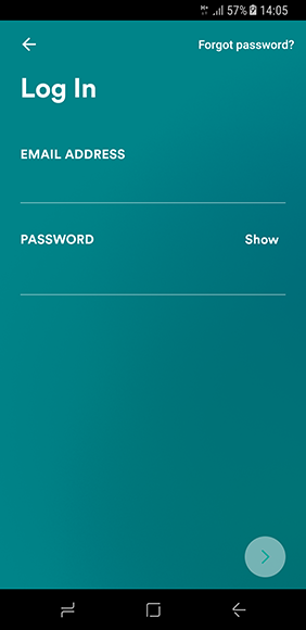
- The login screen looks clean with two text fields for email and password.
- The Screen title is presented in Large font below the action bar, which is kept common throughout the app.
- The forgot password is kept in the action bar instead of the conventional position near the password field.
- Instead of a login button, a button with forward arrow icon has been used, which might not be intuitive for some users.
- They have also used a gradient in the background which also continues throughout the app, with some subtle changes in the gradient
