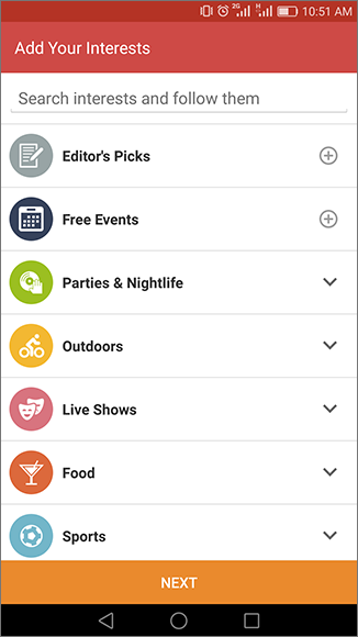
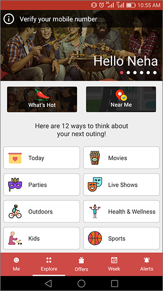
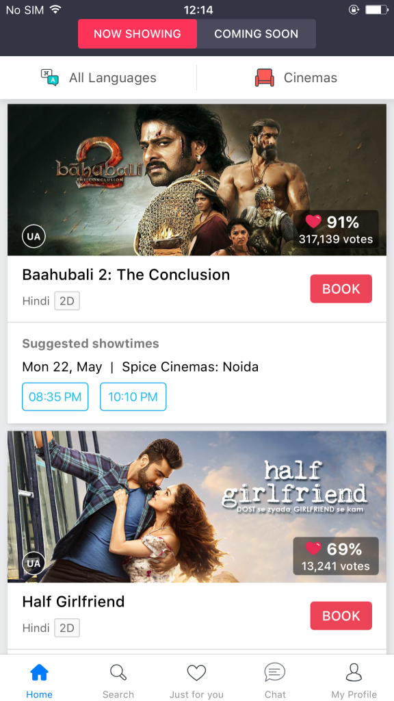
- Use of colors and beautiful icons
- Looks very clean and content is well placed.
Empty data screen with good graphic
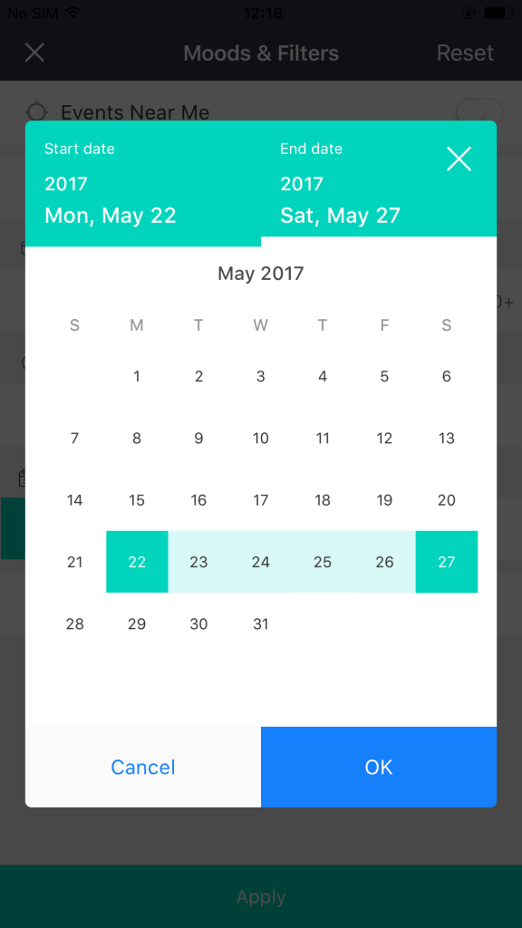
Calendar with date range
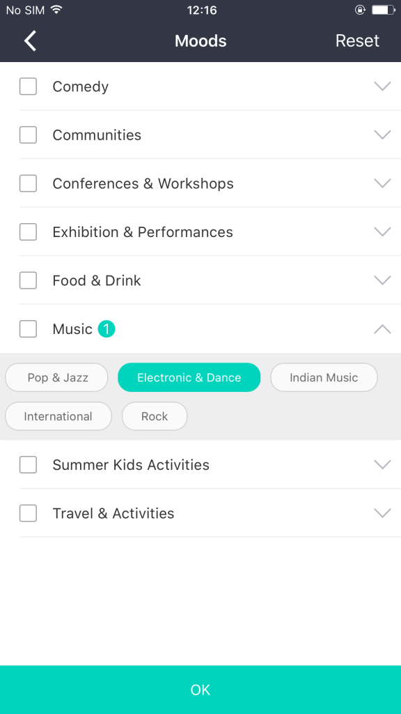
List with some details
Sign Up Pattern – Web
- If we pick any website at random, the most common module is Signup.
- It is generally the face of the website and yet this is where most of the validation errors, messages and alert dialogs are featured and if the signup form contains more six to seven fields, then the process becomes even more exhaustive.
- The reason behind this extensive series of validations checks is that, if user is able to signup then only the purpose of site is met.
- The web pattern that I am going to share is about ways of handling possible validation checks.
- My aim is to make the registration procedure peaceful and hassle free for the user.
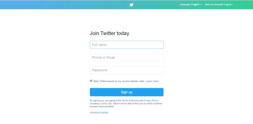
- This is the signup form of twitter.
- It takes only three fields to register with twitter. So before even typing a single letter, the user knows that it isn’t going to be that exhaustive.
- Lets see what else is in store for the user in this process.
Validation Pattern :
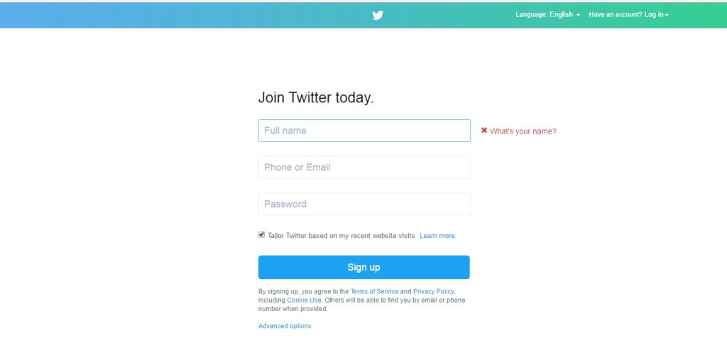
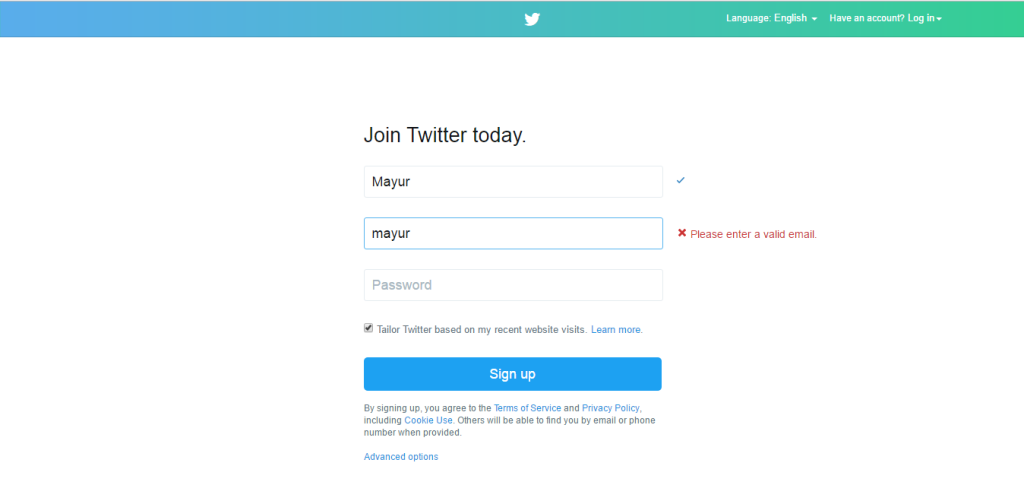
- Here as we can see, “Full Name” field is highlighted.
- By looking at the image it might not be intuitive for the readers but it would be much more clearer for the user if he leaves “Full Name” field blank and taps on Sign Up button.
- Highlighted field indicates that the particular field needs attention of user.
- Usually user’s attention is grabbed by prompting a message but here highlighting the field is doing the job.
- This is one tidy way to prompt the user.
Confirmation Pattern :
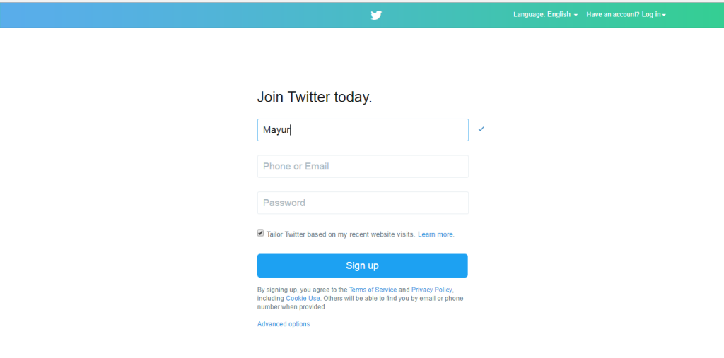
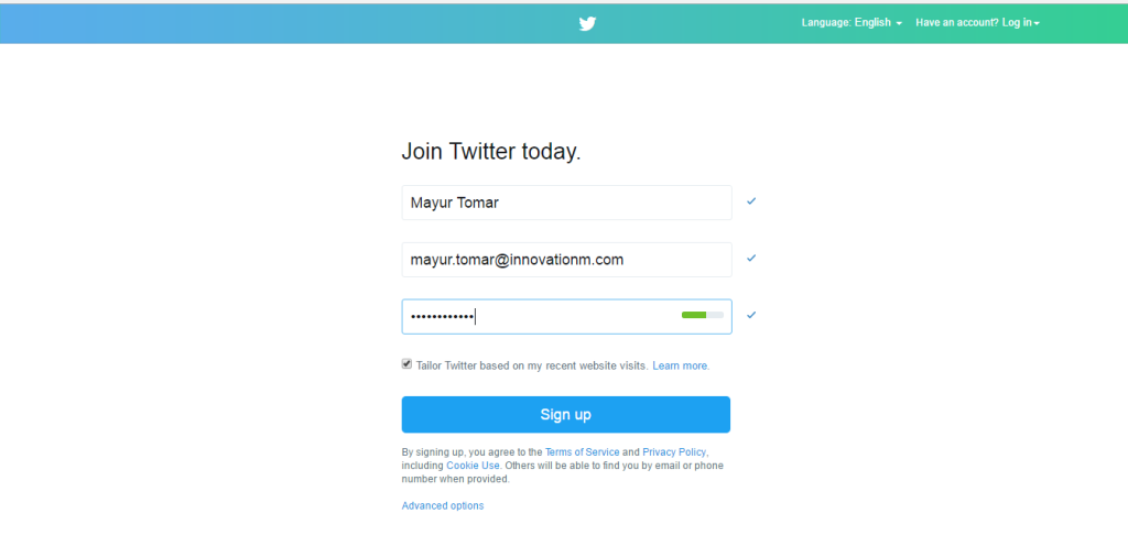
- Notice a small tick mark adjacent to the textfield.
- It indicates that user’s action is validated in every manner. User will know for sure that he doesn’t have to think about the fields for which tick mark appears.
- It elevate the user’s efficiency and also save time.
Error Message Pattern ( I )
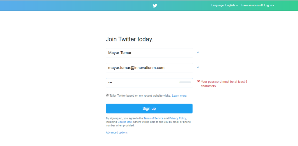
- Notice a message adjacent to the text field.
- The message appears when user enters any value in the textfield and then erases it. Displaying a message at this point indicates that field is mandatory and it’s better not to leave it empty.
- In usual practice these kind of messages are displayed after sign up button is clicked. But in this pattern, it save time of the user.
Error Message Pattern ( II )
- This is same as above pattern i.e a message adjacent to the text field.
- Here if user has entered invalid email, the message will be displayed and it will on display until and unless user has entered a valid Email Id.
- Once the Email Id is valid, the message will replaced by tick mark
Error Message Pattern ( III )
- Similarly for password field, message adjacent to the password field will be on display until entered password meets the validation criteria.
- Notice a small empty bar inside the password field. It is discussed in next section.
Password Strength Pattern :
- The small bar inside the password field indicates the strength of the password.
- Usually, we use texts like [ Weak, Moderate, Strong etc. ] to indicate password strength.
- But here a simple small bar is more than enough.
- If the bar is filled that means password strength is strong and so on.
This is a very simple pattern but it is more intuitive and enriches the user experience exponentially. This pattern helps user to spend less time on registration process also the design looks sober and elegant.
Filter from top
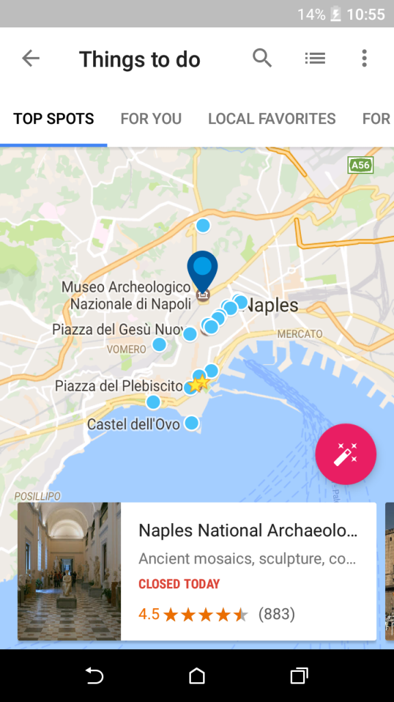
Scrollable Tabs with Map View
- Under this section user has ample amount of choices of where he can go.
- This section reveals all the famous spots of the particular place. The more famous place is, the more choices user will have.
- This is the map view of the famous places, user also has the option to switch to the list view by tapping second icon on the top right corner.
- This is a good option to switch between two views.
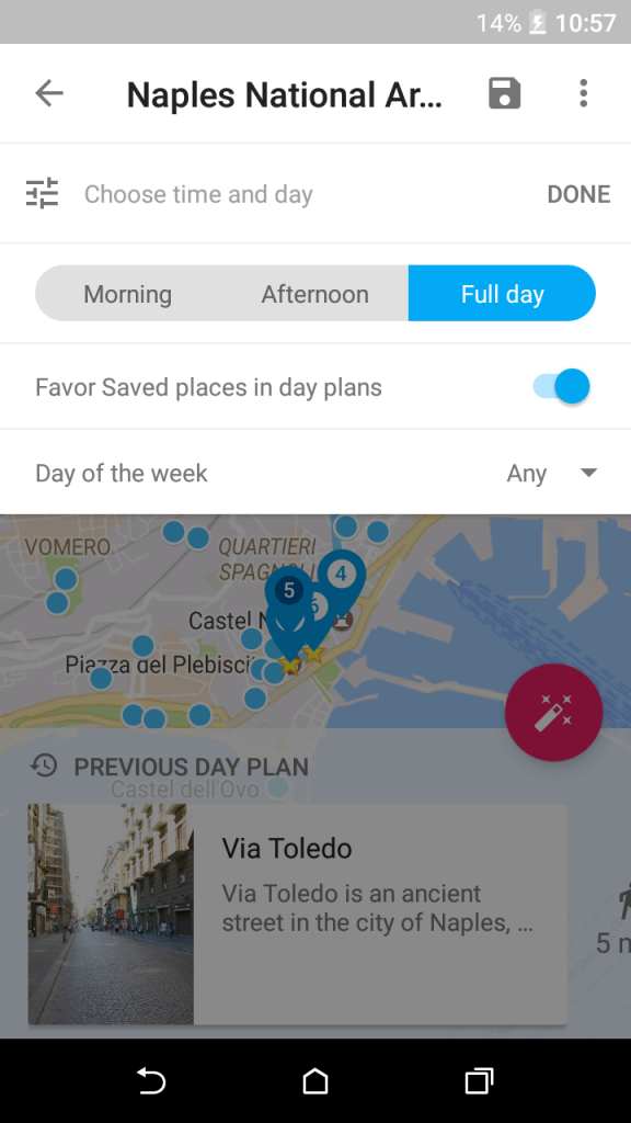
- By tapping on the Pink floating button user can plan his day.
- This is the most striking feature of the application and so it is highlighted in such manner.
