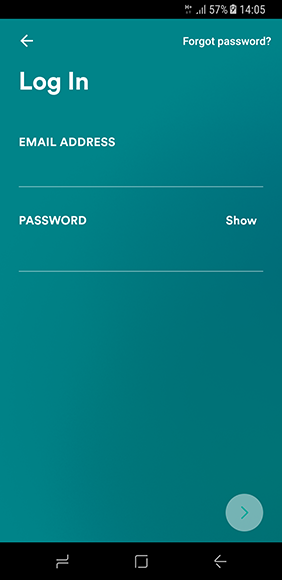
- The login screen looks clean with two text fields for email and password.
- The Screen title is presented in Large font below the action bar, which is kept common throughout the app.
- The forgot password is kept in the action bar instead of the conventional position near the password field.
- Instead of a login button, a button with forward arrow icon has been used, which might not be intuitive for some users.
- They have also used a gradient in the background which also continues throughout the app, with some subtle changes in the gradient
