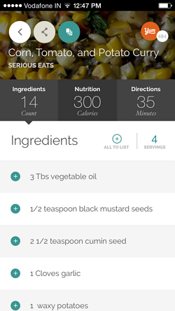
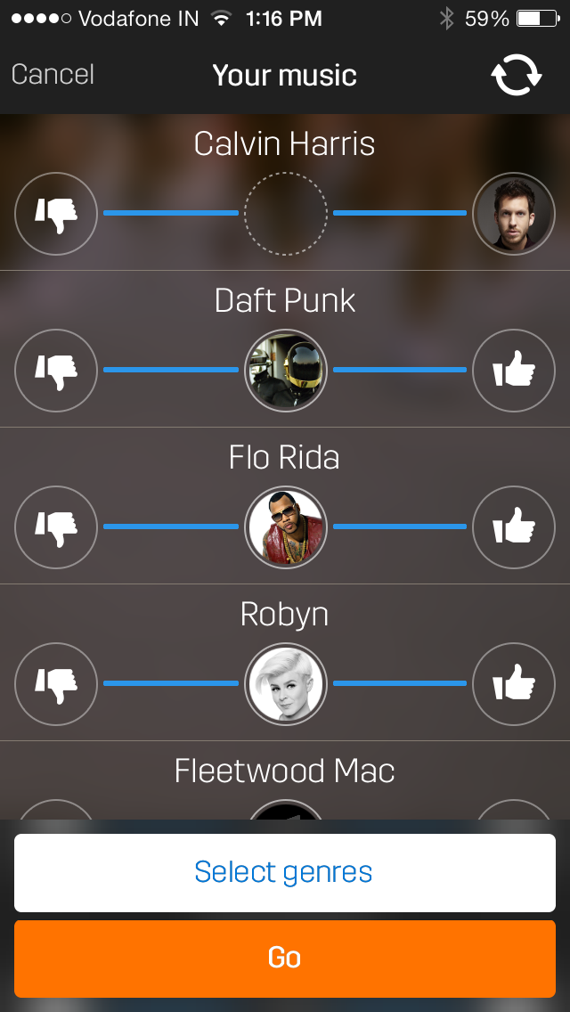
Beautiful way to organize the content by using tabs.
Android UX Design
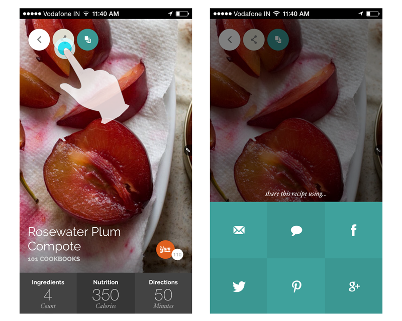
Sharing Options in Grid
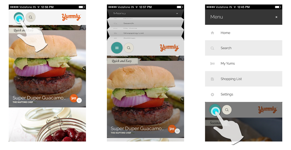
Menu in Folding Page Style
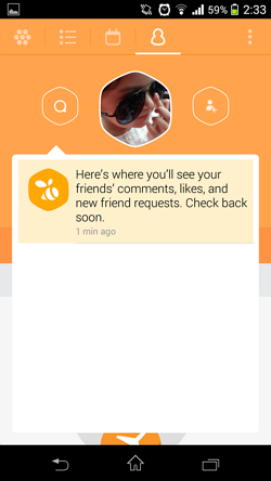
Fixed Tab in Action Bar
Pop-up with link to the Subject
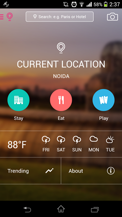
Dashboard
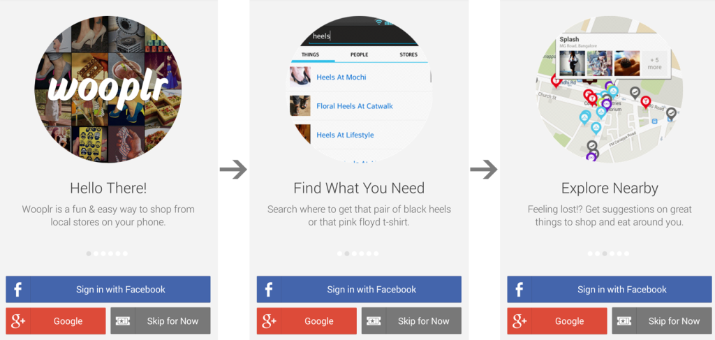
Application Walkthrough
An application walkthrough is used to make the user acquainted about how an application works just by looking at it.
The above walkthrough uses thumbnails of different features of the application.
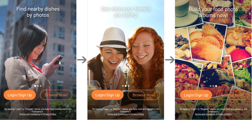
In the above walkthrough pattern, image occupies the whole length and width of the screen. Buttons and text are used on the image.
In the above image, vertical slider is used to display the walkthrough / tour of the application.
 This walkthrough pattern with a simple and clean UI help user to get a quick idea of the application.
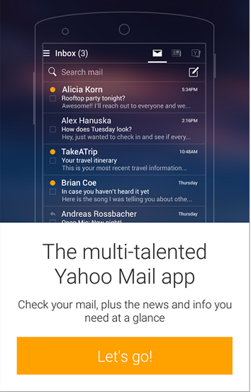 In this pattern, the line diagram of the device and the content looks very sleek and nice.
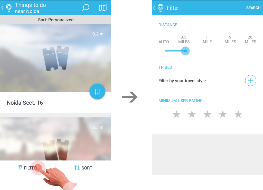
Filter in Tab Bar opens in New Screen
Sorting Menu in Sliding Drawer
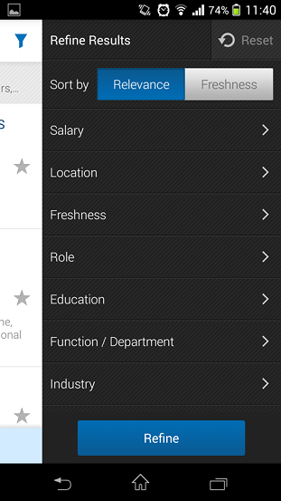
Some applications consolidate the sort and filter options into one screen, typically titled “Refine.” This is the most effort intensive sort pattern, requiring the user to open the sorting drawer, select an option, and then apply the selection (by tapping “refine” in this case).
